Components
Every component in the system. Each page previews the real component and generates its code.
110 components in 12 categories
Buttons
5 components ButtonThe action control: five tones, three sizes, with optional leading and trailing icons or an icon alone, a small avatar before the label or a count after it.
 Button groupSeveral buttons acting as one control: spaced apart, or segmented into one bar with dividers.
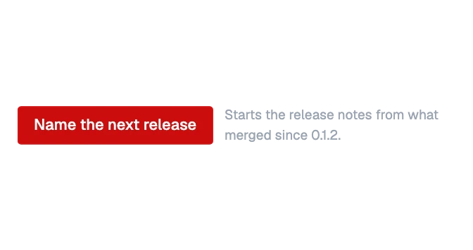 Button noteA button with a short line of quiet words that says what pressing it will do, or why it cannot be pressed now.
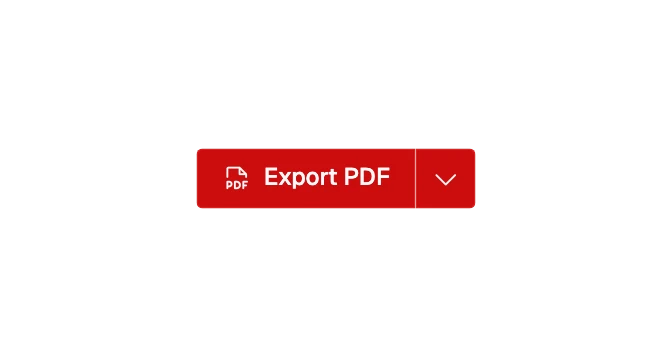 Split buttonOne safe default action with a menu of related ones: a button and a caret button joined into one bar, the caret opening the menu.
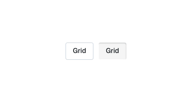
 Toggle buttonA button that stays on or off, such as bold text, a map layer or a filter: the outline or ghost button when off, sunken into the page when on.
Inputs
17 components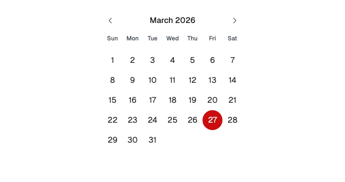
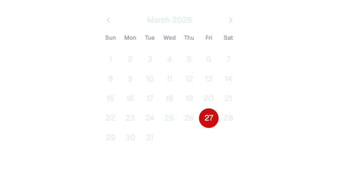 CalendarA month of days to choose a date or a range of dates from, with buttons to the months before and after; it spreads its columns across the width it is given.
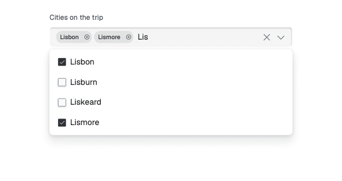
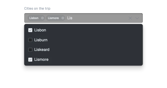 ComboboxA box to type in that suggests matches from a list, for one choice or several: the input’s well, the dropdown panel under it, and each pick a chip.
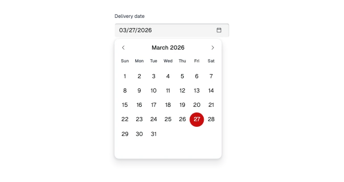
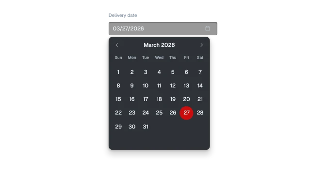 Date and time pickerA date, a time, or both, typed the reader’s own way or, for a date, chosen from a small calendar that opens under the field.
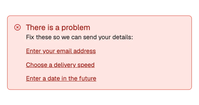
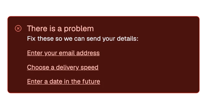 Error summaryA box at the top of a form after a failed send, listing every mistake as a link that moves focus to its field.
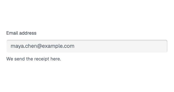
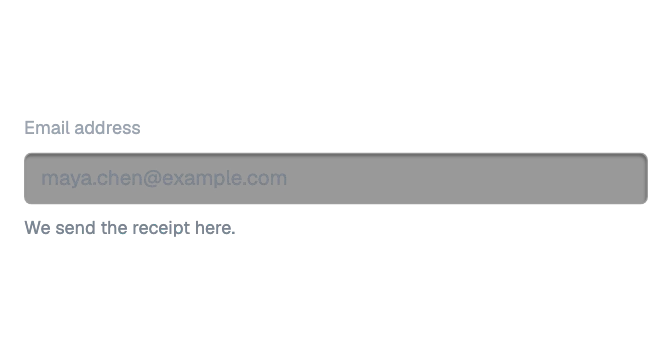 FieldThe frame around one form control: its label with an optional required mark, and help text or an error message under the control.
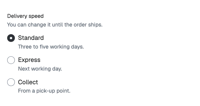
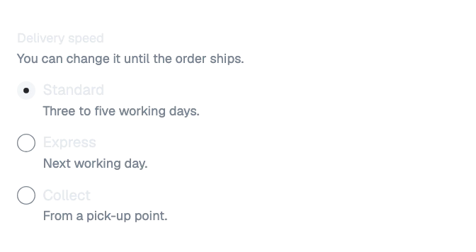 Field groupSeveral radios, checkboxes or choice cards under one question: a fieldset with its legend, help, and one error message for the group.
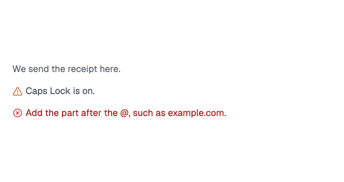
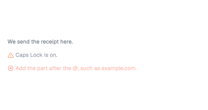 Field messageThe line under a field or a group of choices: help that says what to enter, a warning to notice, or an error that says what is wrong.
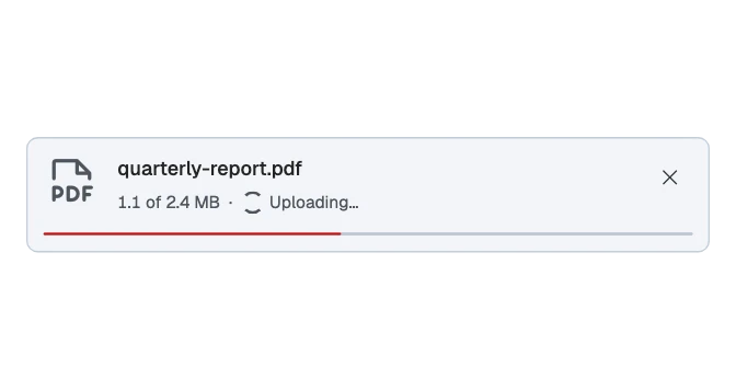
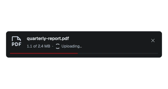 File rowOne chosen file: its name, size and state, its progress while it uploads, and what can be done with it.
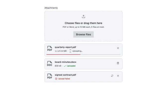
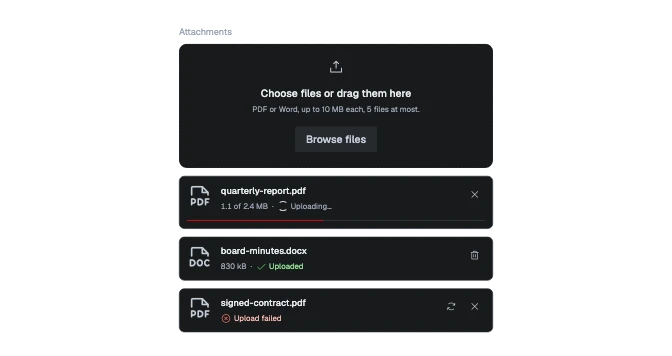 File uploadA place to choose files or drop them, with what is accepted said first, and each chosen file in a row below with its progress and result.
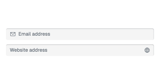
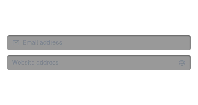 InputA single-line text field: a sunken well with an optional icon at either end, room for content before the value and an action after it, in three sizes.
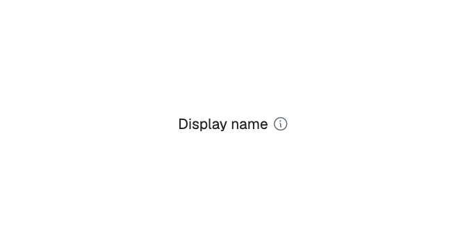
 LabelA field label: the text, an optional required mark, and an optional info icon that carries a tooltip.
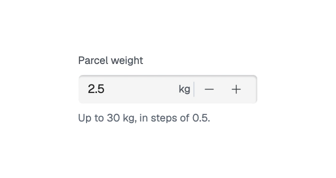
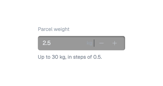 Number fieldA text field for a quantity or a measure, with its unit and minus and plus buttons that step it between its limits.
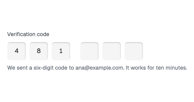
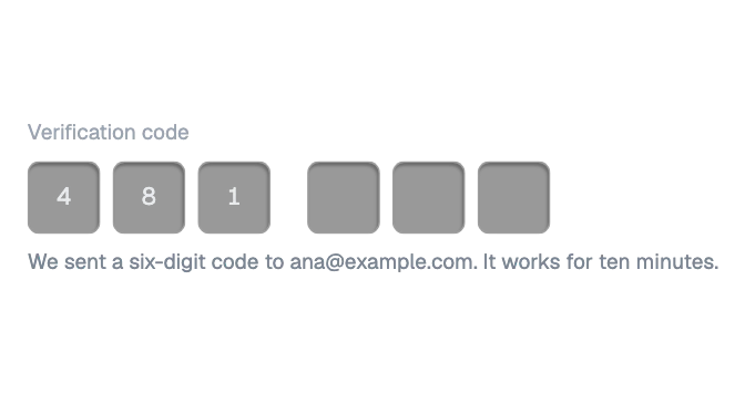 One-time code inputSix boxes in two groups of three that act as one field, for a code sent by email or text message.
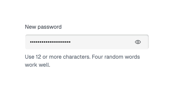
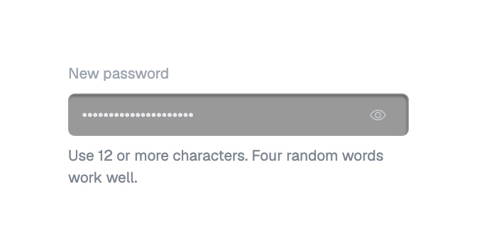 Password fieldA text field for a password or a passphrase, with a button at its end that shows and hides what is typed.
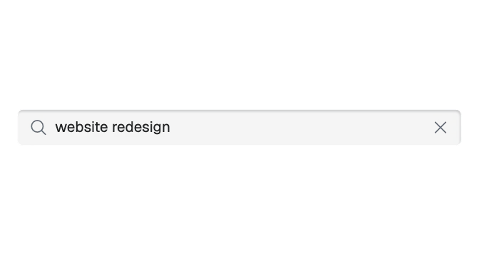
 Search fieldA text field for filtering or searching, with a magnifier before the text, a clear control after it and an optional key hint at the end.
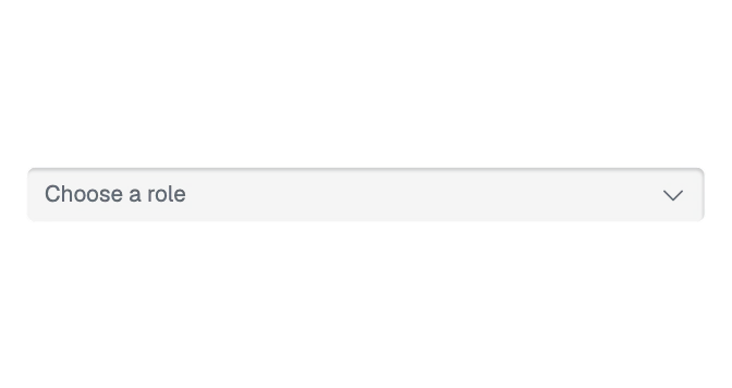
 SelectA choice from a list: the input well with a caret, opening the dropdown panel with one item per choice, in groups under a heading if wanted, each choice with a picture or an icon and a second line if wanted.
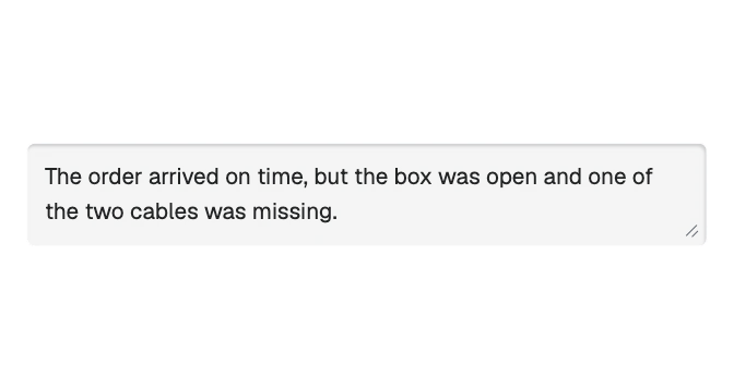
 Text areaA text box for several lines: the input well grown tall, with a grip at its corner to make it taller.
Controls
8 components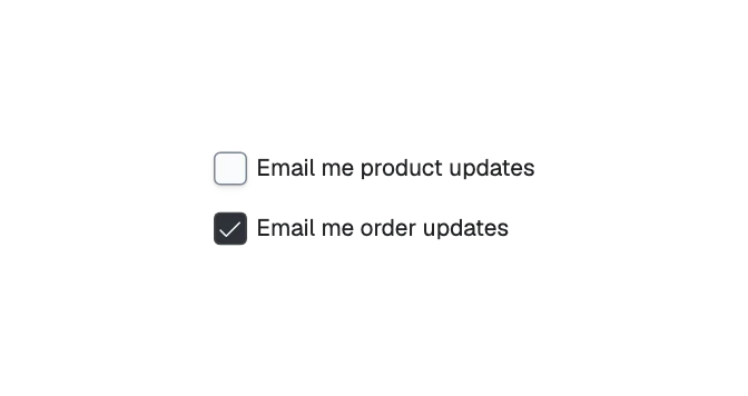
 CheckboxA box that is ticked or not, with its label beside it and an optional line under the label, for choices that are independent of each other.
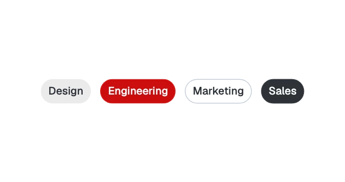
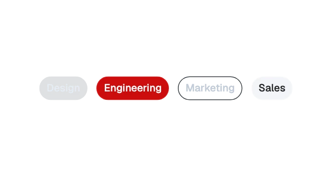 ChipA small selectable token — a filter, a choice, a person — that can carry an avatar and be removed.
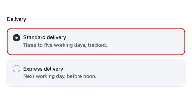
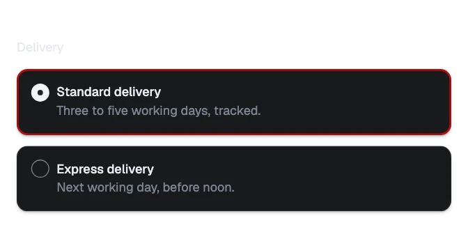 Choice cardOne choice drawn as a card, with a label and a line under it: picked like a radio, or ticked like a checkbox.
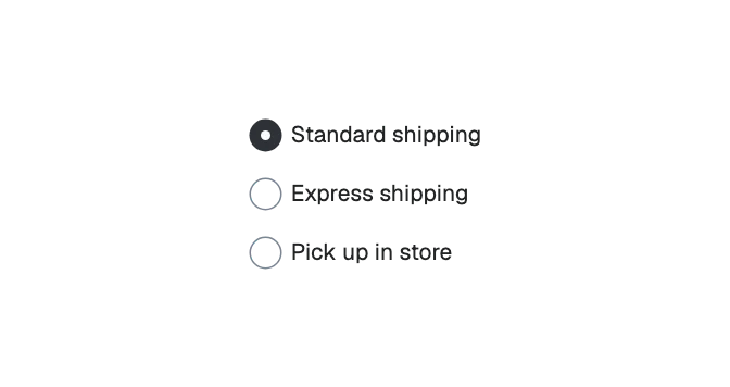
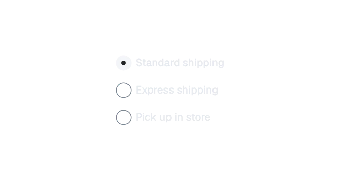 RadioOne of several choices, only one of which can be chosen, with its label beside it and an optional line under the label.
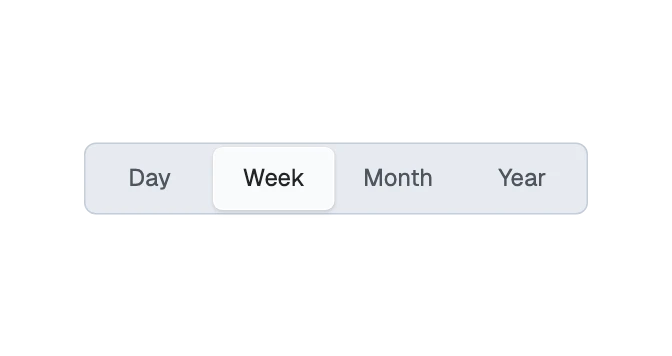
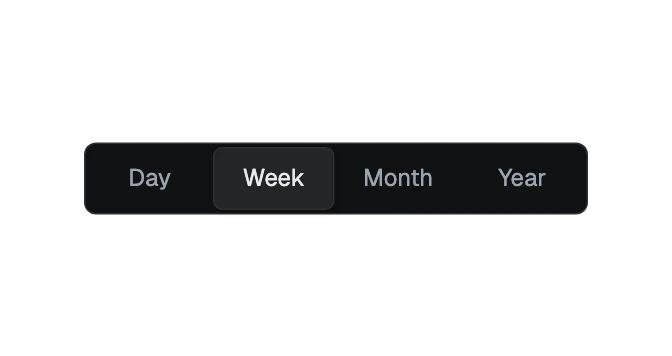 Segmented controlA row of named choices in one bar, one of which is selected, with the selected one raised.
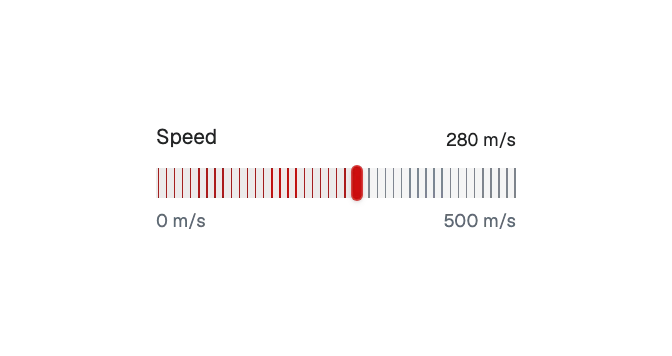
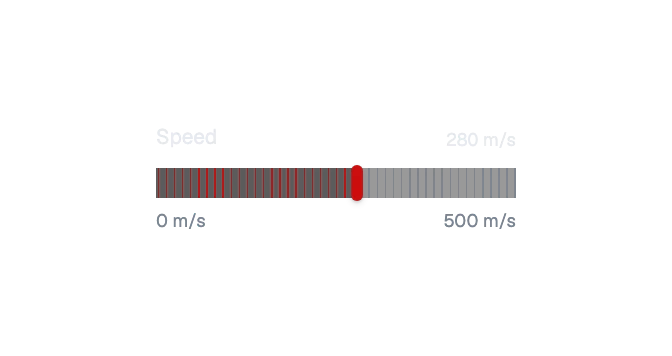 SliderChooses a number, or a lowest and highest number, along a range by dragging, clicking or the arrow keys: fine lines that turn red up to a narrow thumb, a thin line with a round thumb, a filled bar, or a tall filled bar with its label and value inside; a number box beside it takes a typed value.
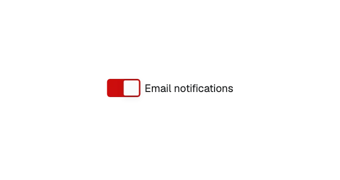
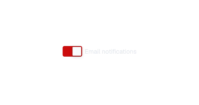 SwitchAn on-or-off control that takes effect at once: a filled track with a light thumb that slides to the on side.
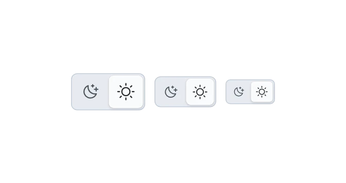
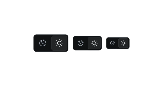 Theme switchThe light-or-dark switch: two icon segments in one bar, the active one raised.
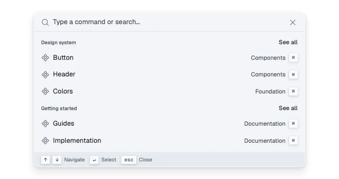
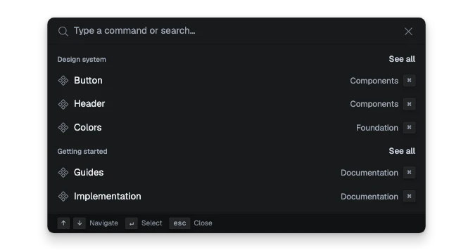 Command paletteA search-first panel of commands: type to filter, arrow keys to move, Enter to run, with groups under small labels and key hints at the foot.
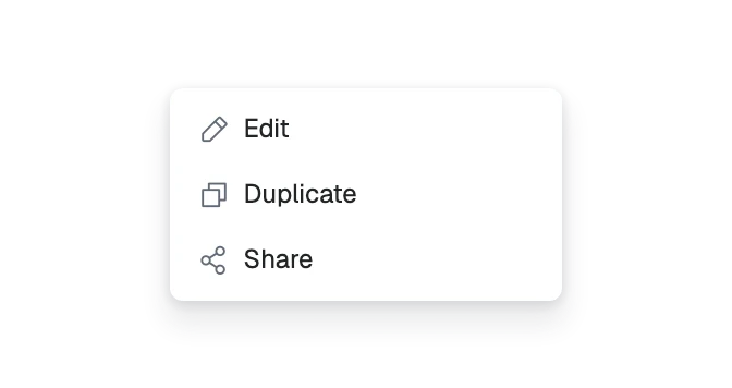
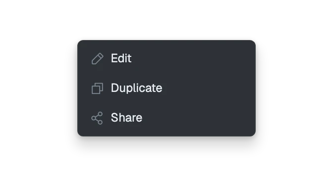 DropdownA raised list of actions or links that opens from a button: grouped items with an icon, a label, a key hint, an optional tick box or single-choice tick, items that open a second menu beside them, and a red one for the destructive action, in two item heights; it can also open at the pointer as a right-click menu.
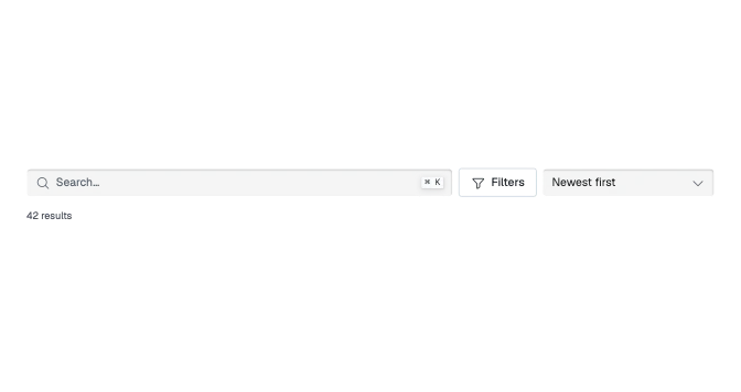
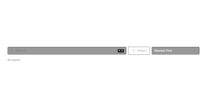 Filter barSearch, filters, sort and Clear all together above a list or a table, with the filters applied as chips and the number of results they leave.
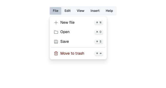
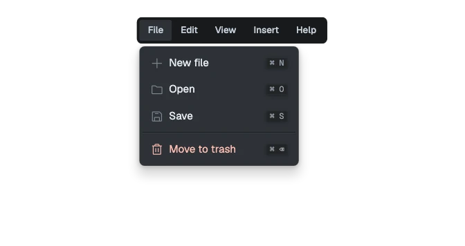 MenubarA row of menu titles, as at the top of a desktop app (File, Edit, View), each opening a dropdown menu; the arrow keys move along the bar and from one open menu to the next.
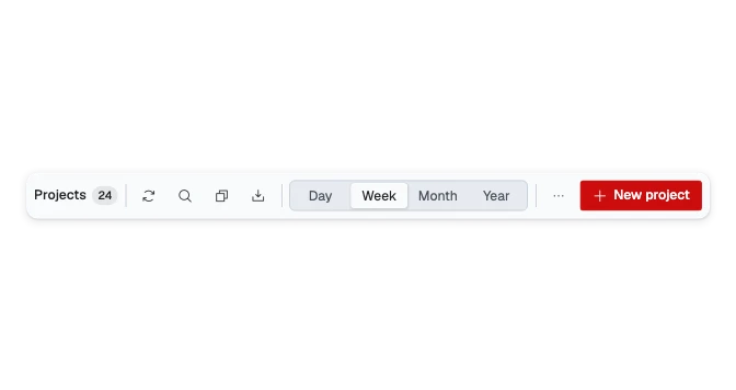
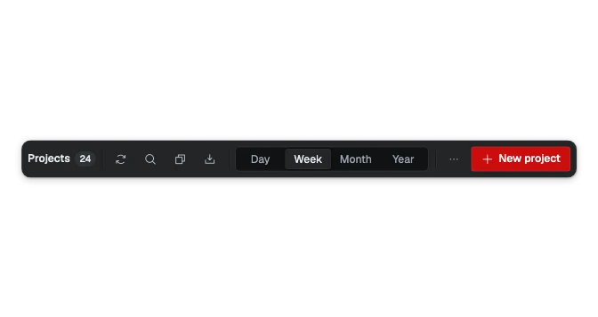 ToolbarA labelled bar of related tools for a view, a selection or an editor: what it acts on, groups of tools, and its main action, moved through with the arrow keys as one Tab stop.
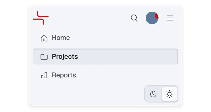
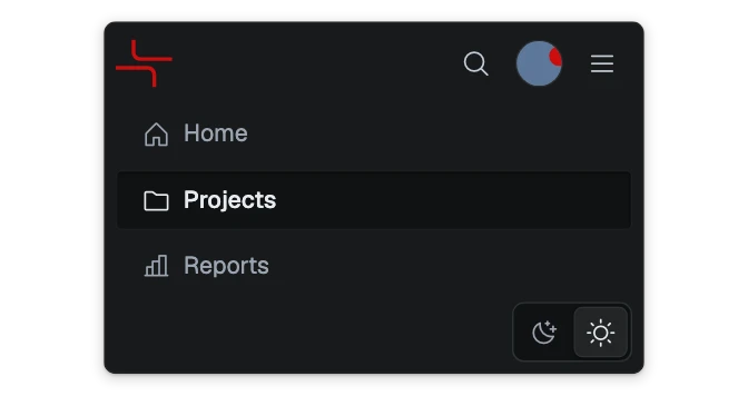 App barThe top bar of an application: brand, navigation links, then search, action buttons, the theme switch and the user, in five looks; the links fold into a menu when they do not fit.
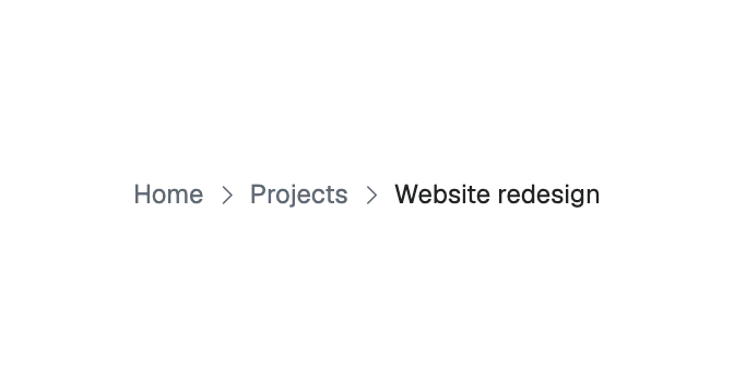
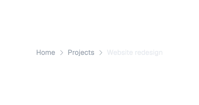 BreadcrumbsThe trail of pages above this one, each a link, ending on the page the reader is on.
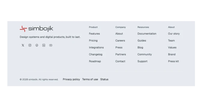
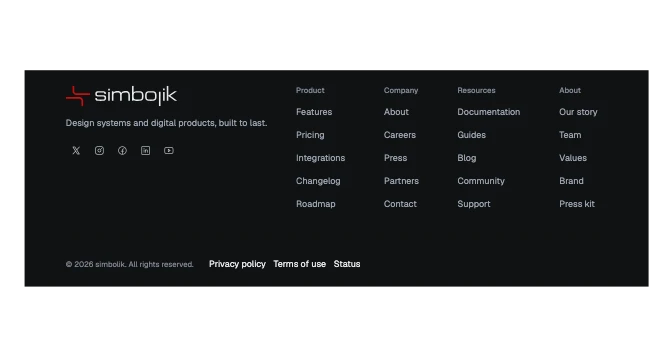 FooterThe foot of a website in six looks: the brand, page links in columns or a row, and a legal strip; on a phone the columns fold into rows that open.
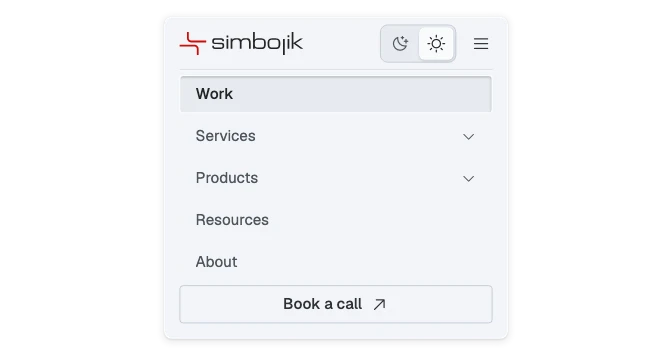
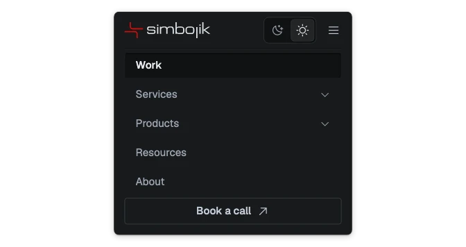 HeaderThe top of a website: brand, page links, a call to action and the theme switch, in five looks; the links fold into a menu when they do not fit.
 LinkText that goes somewhere, in three sizes or the size of the text around it, with an optional icon; underlined, unless it stands on its own. As a button it stays in the color of the words around it and opens something where it stands.
 Navigation itemOne link in a navigation list, with an optional leading icon, an optional count or dot, and a caret when it opens a group of further links.
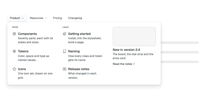
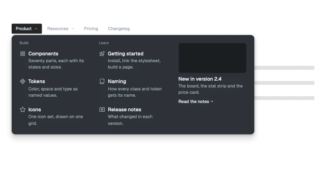 Navigation menuA site header's links, where an item with a caret opens a wide panel of described links and a featured column.
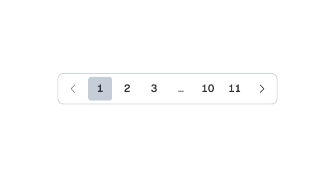
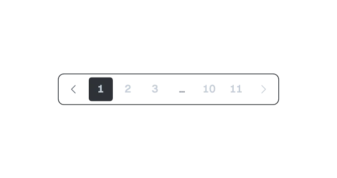 PaginationMoves between the pages of a long list: numbered buttons in a bar, Previous and Next around a select of pages, or a range readout for a table.
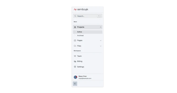
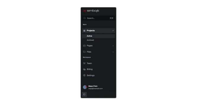 SidebarThe side panel of an application: the logo, search, labeled groups of links with children, the user, and at the foot a button that keeps it open, keeps it a column of icons, or lets it open over the page when pointed at.
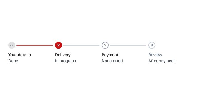
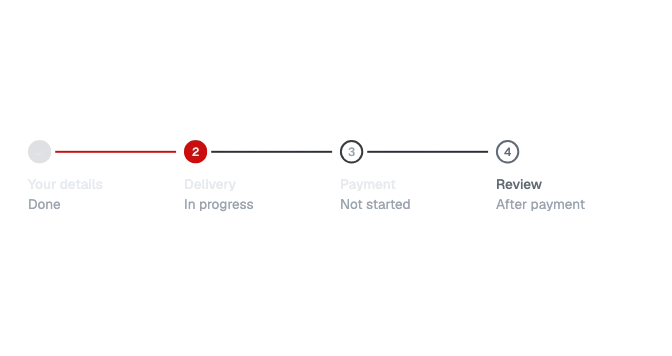 StepperWhere the reader is in a form or task of three or more ordered steps: each step's mark, name and status in words, joined by a line; or "Step 2 of 4" with the step's name and a slim track.
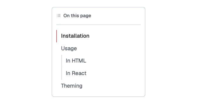
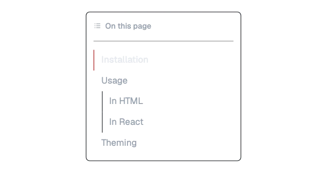 Table of contentsA box listing the sections of the page, children indented, the one in view marked; in a narrow space its heading row opens and closes the list.
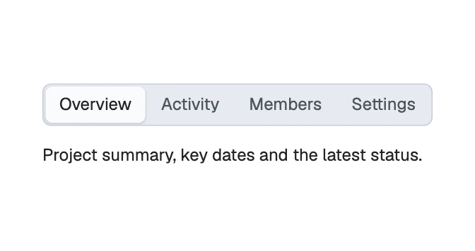
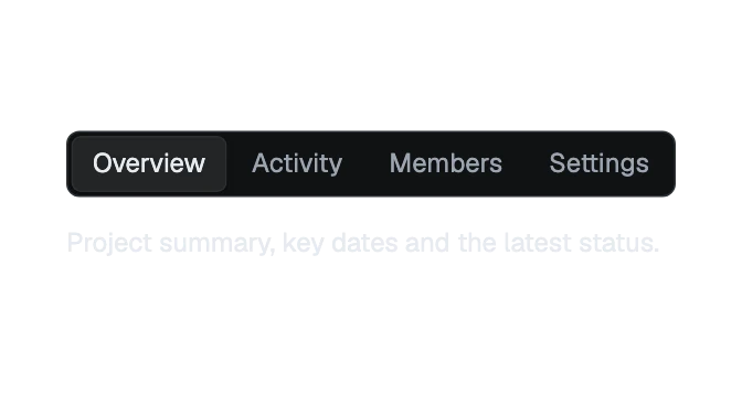 TabsA bar of named views, one shown at a time, each tab in front of its own panel.
Overlays
5 components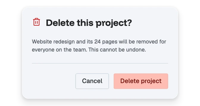
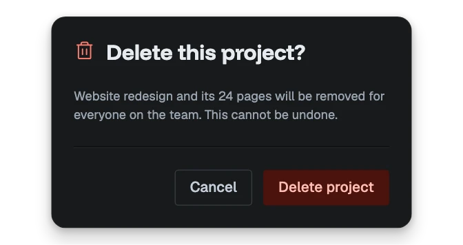 Alert dialogA modal that asks before something that cannot be undone: a title, what will happen, and a cancel and a confirm action. It closes only on them and Escape.
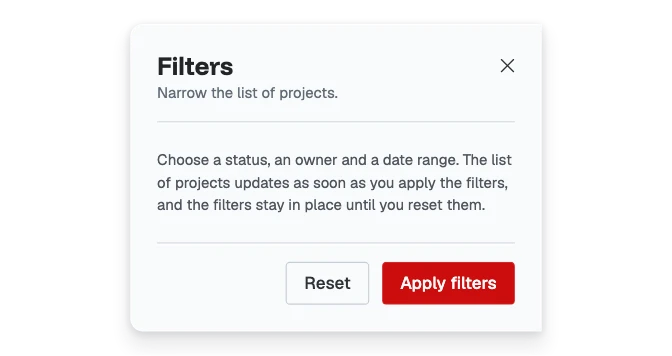
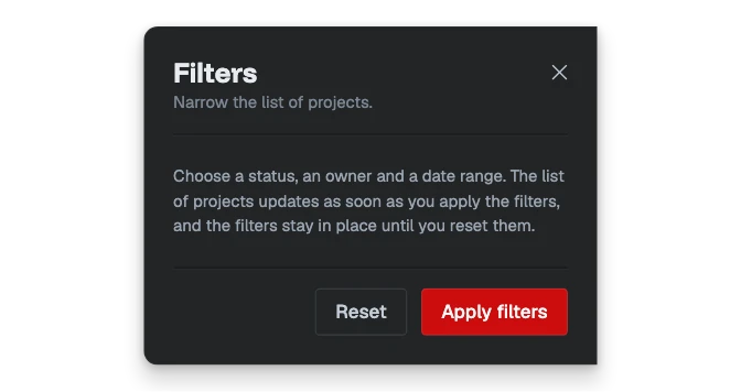 DrawerA panel that slides in from one edge of the window over a scrim, with a header, a scrolling body and a footer of actions.
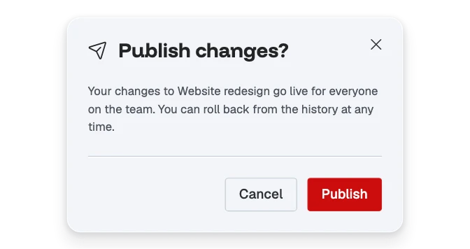
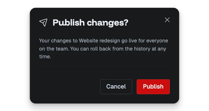 ModalA centered dialog over a scrim for a short interruption: an icon and title, a body, and a footer of actions.
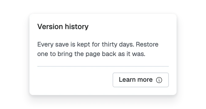
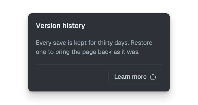 PopoverA small raised panel that opens from a button and stays beside it, holding a title, a few lines or a field, and actions, without blocking the page.
 TooltipA small floating label with an arrow, shown on hover or focus to name or explain the thing under it.
Feedback
9 components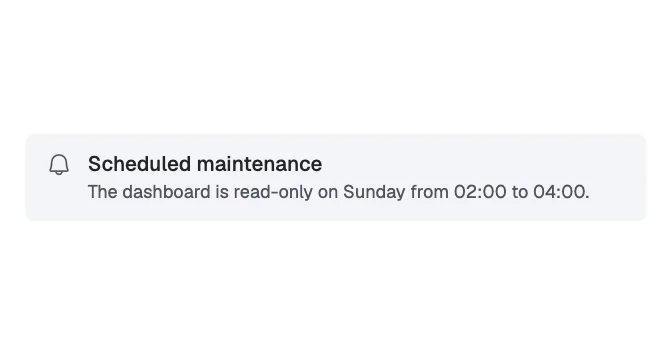
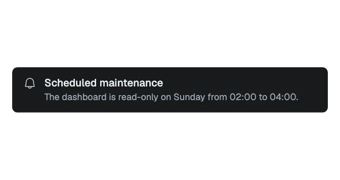 AlertAn inline message that stays on the page: an icon, a title, a description, and an optional action or dismiss control.
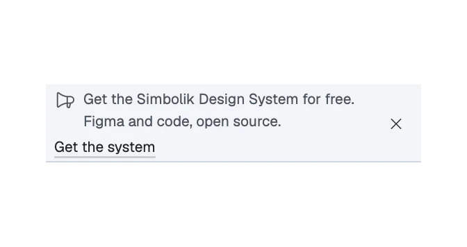
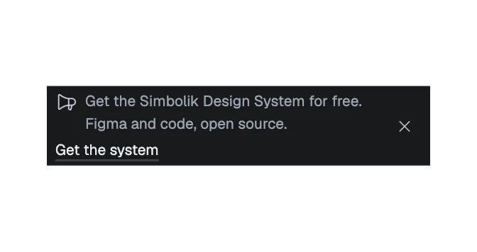 BannerA one-line announcement across the top of a site or app: a short message, an optional link and an optional dismiss control, on a full-width strip.
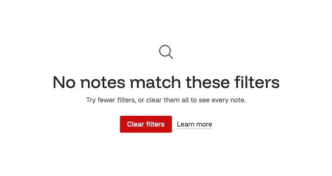
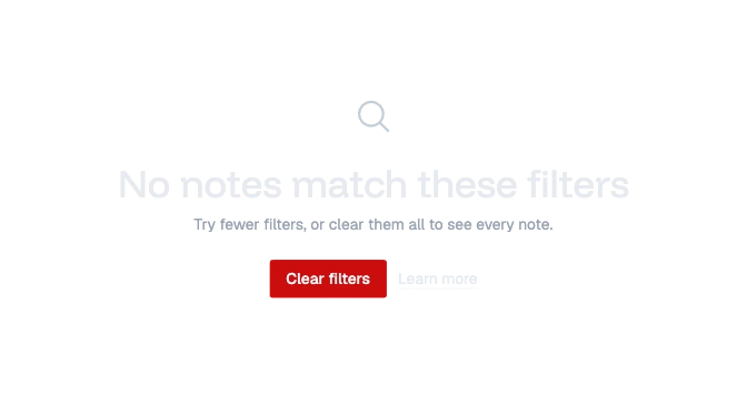 Empty stateThe words that fill an area when what belongs there is missing or failed to load, naming the cause and offering the next step.
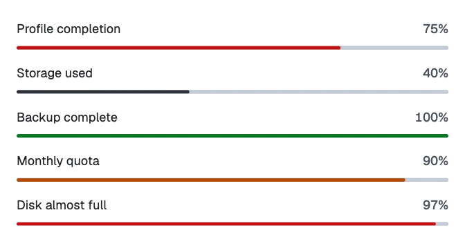
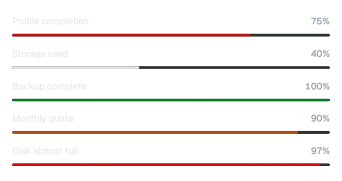 Progress barA track with a fill showing how far something has got, with an optional label and value above it; it can say the work failed, or that its end is not known.
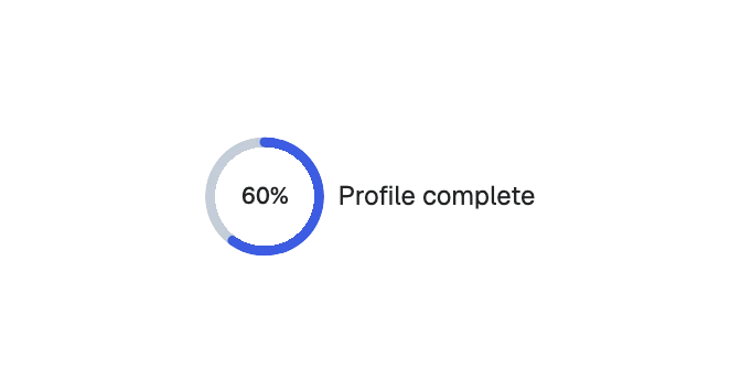
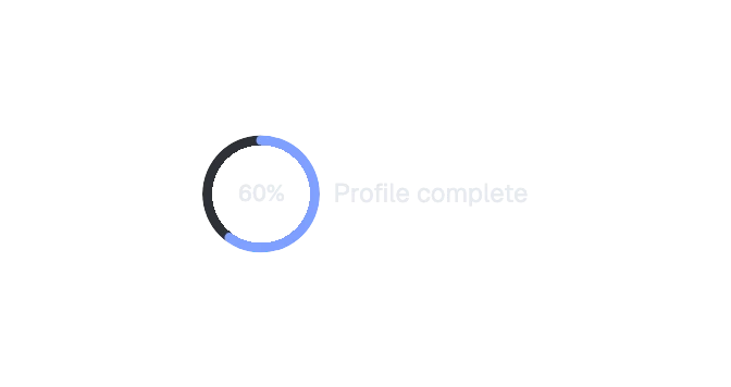 Progress ringA ring that fills clockwise from the top to show how far something has got, with the value in the middle.

 SkeletonA placeholder shown while the real content loads: lines of text, a title, a label, an icon, an avatar, a badge, a button, an input, a media box, a list item, a card or a table row, or the shape of any component it wraps.
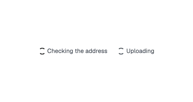
 SpinnerA small turning ring that says something is being worked on, for a wait with no known end: alone, beside its words, or inside a busy button.
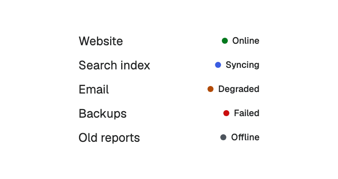
 Status dotA small colored dot that marks a status, with the status in words beside it.
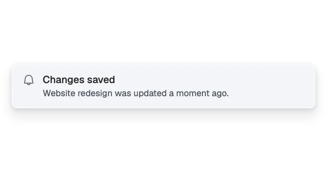
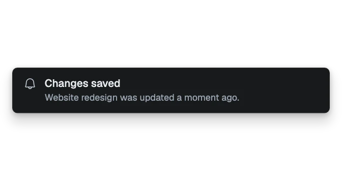 ToastA short-lived message that floats above the page: the alert's anatomy, raised, arriving in a corner and leaving on its own after a few seconds unless someone is reading it.
Data display
17 components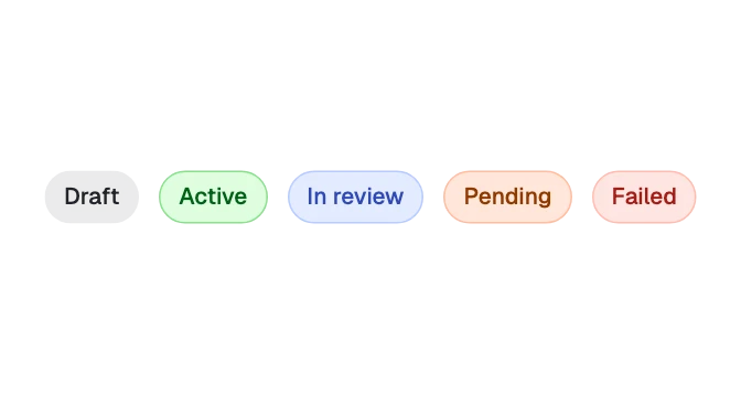
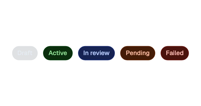 BadgeA small status marker: a soft or flat pill with a label and optional icons.
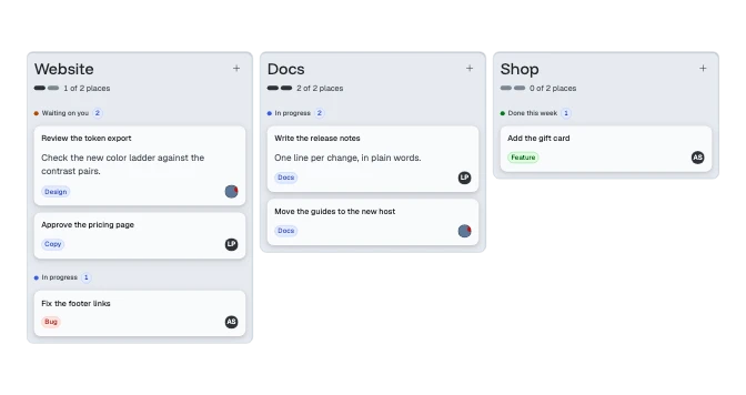
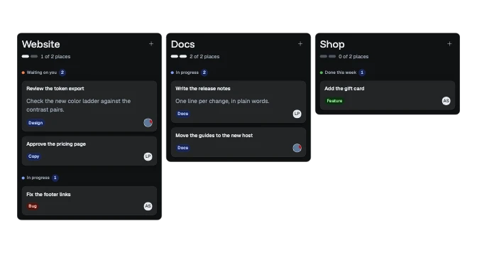 BoardColumns of cards, side by side on a wide screen in a frame that scrolls sideways, and stacked on a phone.
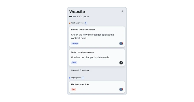
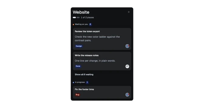 Board columnA lane of cards on a board: a title with a capacity meter and an action, then groups of cards, each with a label and a count.
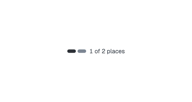
 Capacity meterA row of two to four short bars, as many filled as places are taken, with the same in words, such as "1 of 2 places".
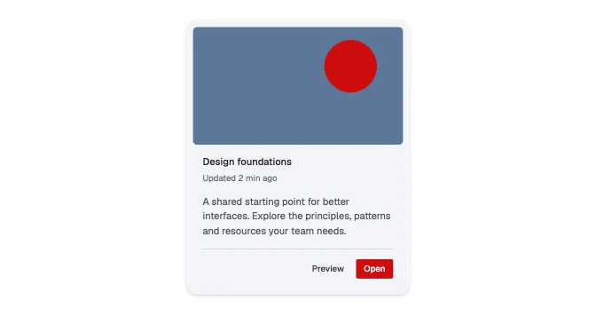
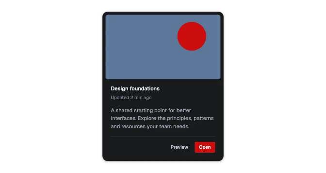 CardA bounded box about one thing: an optional picture, a header, a body and a footer, on one of five surfaces and in one of five layouts.
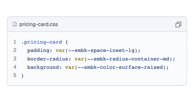
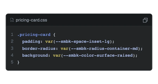 Code blockCode in a well, colored by kind and numbered by line, with a top bar for a file name or language tabs and small icon actions such as copy.
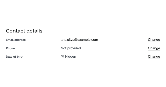
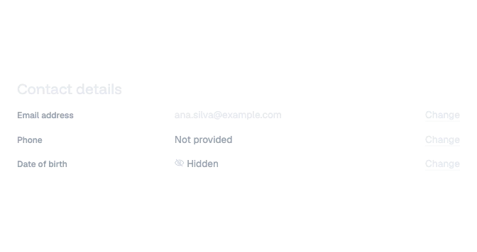 Description listThe facts about one thing, as rows of a name and its value, such as an account’s details or a record’s fields, with an optional action on each.
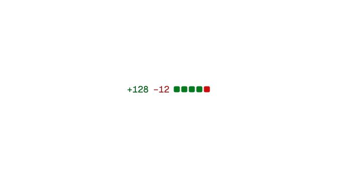
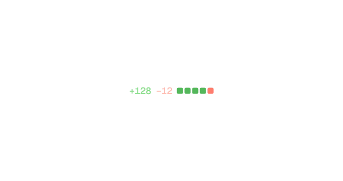 Diff statHow much a change touched: the lines added and removed, such as "+128 −12", and a row of five small squares that shows the balance.
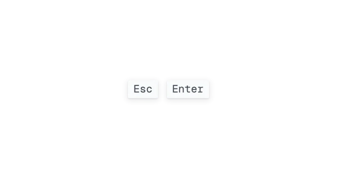
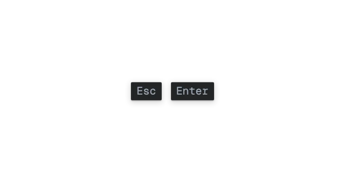 KbdA keyboard key: a small raised square with the key's symbol in the label face.
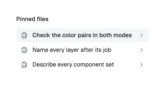
 ListRows of the same kind, one thing each: plain, bulleted or numbered text, or rows with an icon, a title and a quiet line that go somewhere, do something or can be chosen.
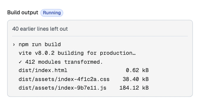
 LogWhat a program prints as it runs: wrapped lines in a well that keeps the newest in view until the reader scrolls up.
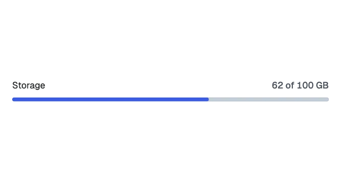
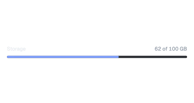 MeterA short bar showing how full something is inside a known range, such as storage used, with an optional label and value.
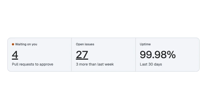
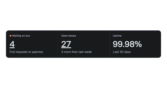 StatOne figure with its name and a line of what it means, plain or as a link to where the figure comes from.
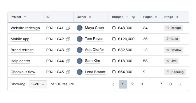
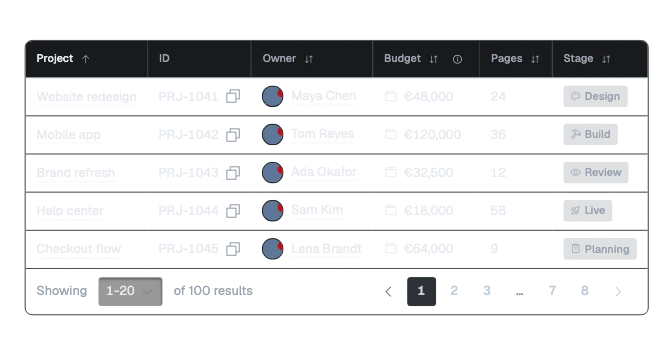 TableRows of data under headings that sort, filter and explain, with rows that open, pin or group, optional selection and a foot for the pagination.
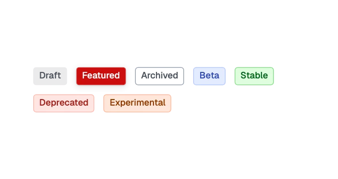
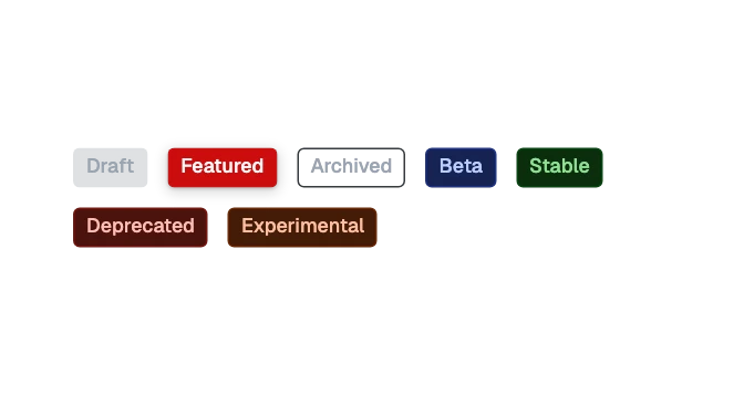 TagA small label naming a category, with an optional leading icon or picture and remove control; pressable, it opens something about what it names.
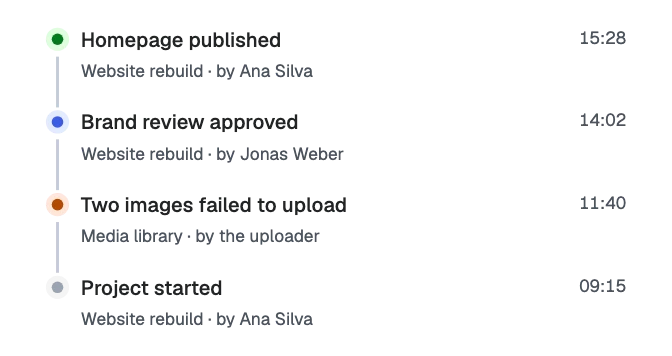
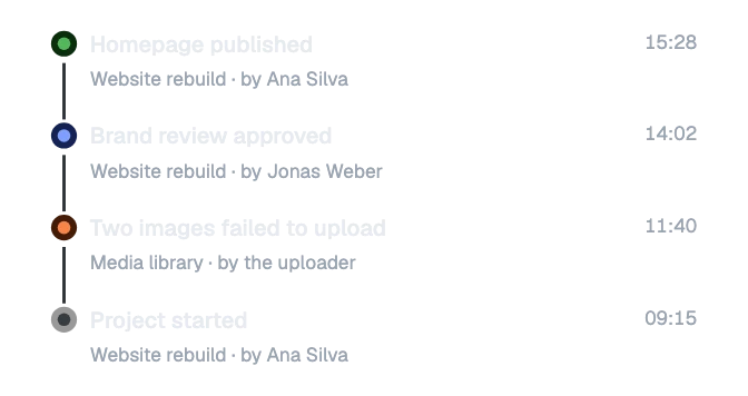 TimelineThings that happened, one after another: each event a dot for its kind, what happened, when, and who or what did it, joined by a line.
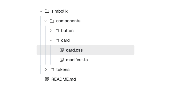
 Tree viewFolders and files, or any list that nests, opened and closed level by level: one row each, with a caret, an icon and the label.
Charts
7 components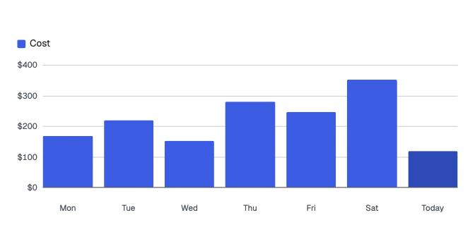
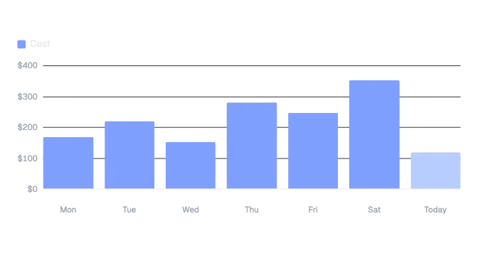 Bar chartAmounts side by side, such as a week of days or a month: plain bars, or bars stacked by kind with a legend, over a value axis and light grid lines.
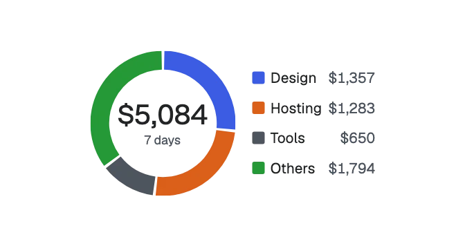
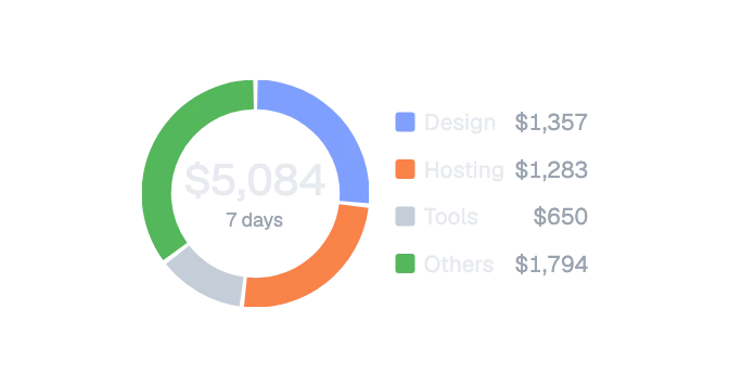 Donut chartTwo to eight parts of a whole as a ring, with the total in the middle and a legend beside it that names each part with its value.
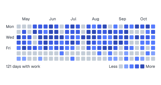
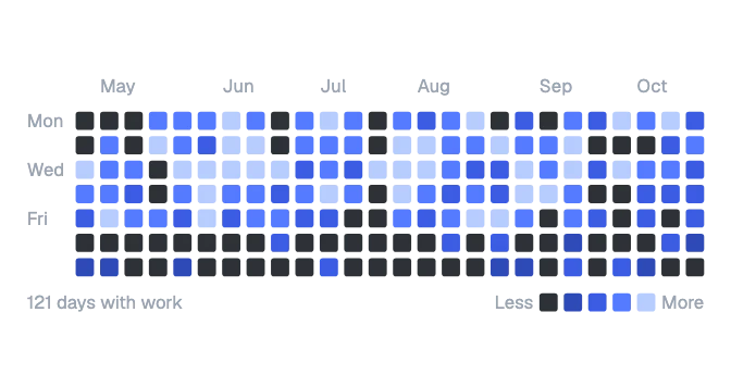 HeatmapA grid of days, a column for each week, each day shaded by how much happened, with the months above, a summary and a scale from less to more.
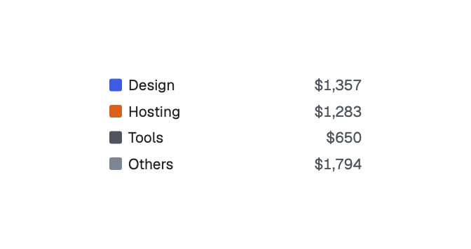
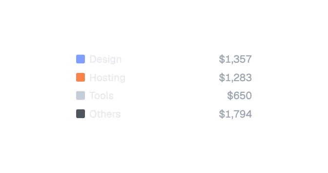 Legend itemNames one series of a chart: a swatch in its color, its name, and its value if shown. A list of them is the chart's legend.
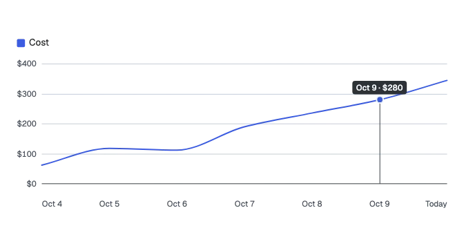
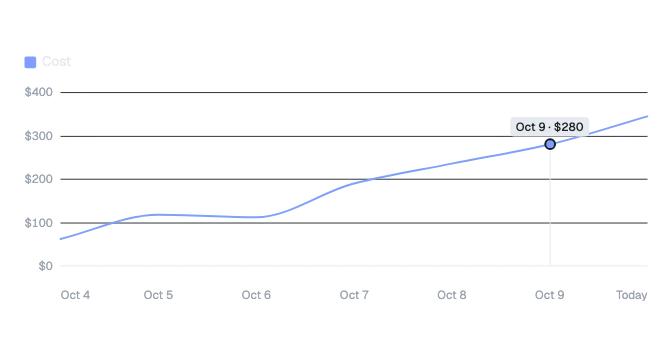 Line chartA trend over time: one line, or the same with a soft area under it, or this period against the last as a dashed line, with a value axis, light grid lines and one marked point.
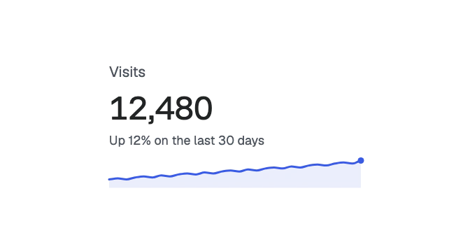
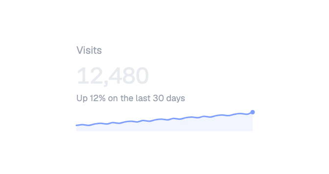 SparklineA small line beside a figure that shows how it moved: rising, falling, steady or spiky. The figure carries the meaning.
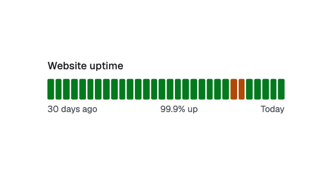
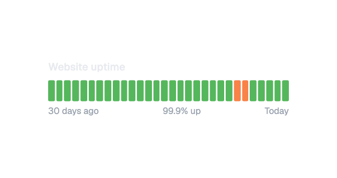 Uptime barA strip of days, one bar each, colored by whether a site or service was up, had an incident or was down, with the share up in words.
Media
7 components
 AvatarA person or thing as a circle: initials, an icon, or a picture, in six sizes.
 Avatar groupOverlapping avatars for the people on a project or a thread, and a count of the rest.
 Avatar with nameA person's avatar with their name beside it and an optional second line, such as their role.
 IconA Phosphor glyph in one of the system icon sizes, inheriting the color of the text beside it.
 Image placeholderA flat block that stands where a picture will go, for empty states and mockups.

 LogoThe Simbolik brand mark: the full logo, the mark alone, or the wordmark alone, colored by the text roles; or a site's own logo as shapes or as a picture file.
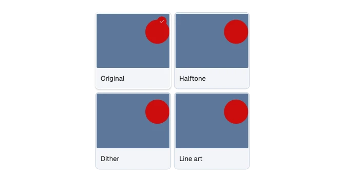
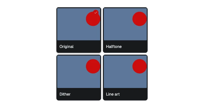 Picture tileA pressable tile with a picture and a short label under it, for choosing among looks, presets or templates in a gallery.
Layout
6 components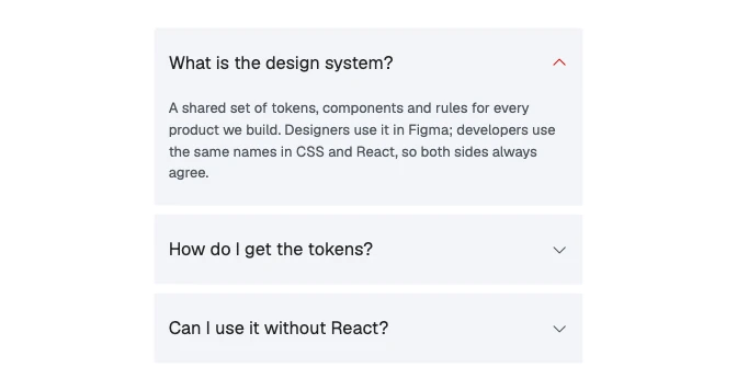
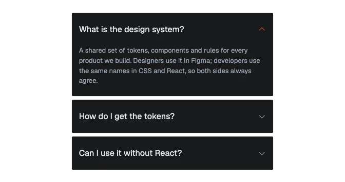 AccordionA stack of headings that each open to reveal their content, as separate cards or as a flat list divided by rules.
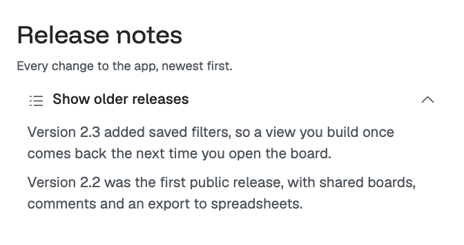
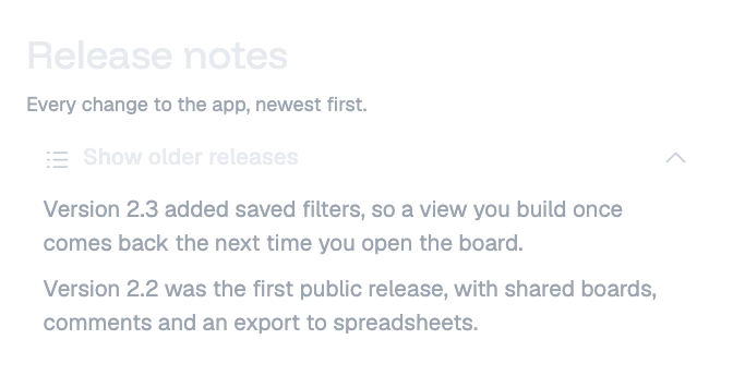 CollapsibleOne row that shows or hides the content under it, for detail most readers can skip.
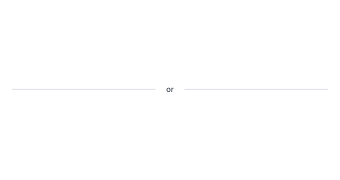
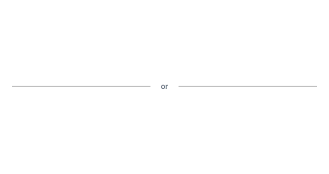 DividerA two-line rule — a shade line over a highlight line — that separates content, optionally with a word in the middle.
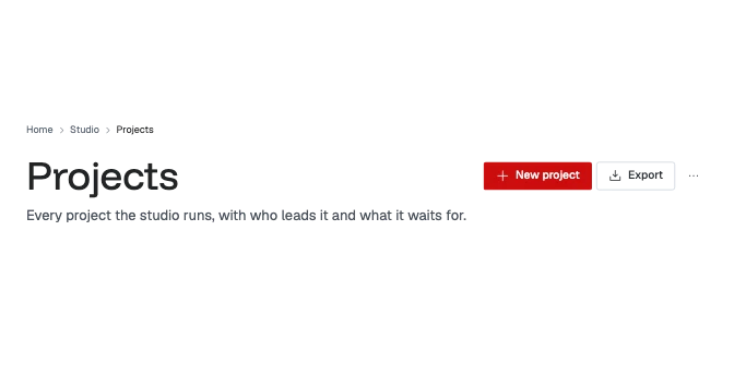
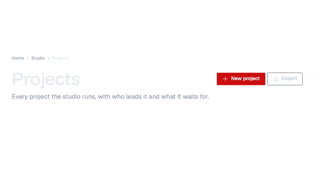 Page headerThe top of one page or one object: the breadcrumbs, the page’s one main heading, a short introduction, its status, and the few actions for the whole page.

 Section headingThe heading row of a section or a panel: its title, how many it holds, a quiet line such as how fresh it is, and one action at its end.
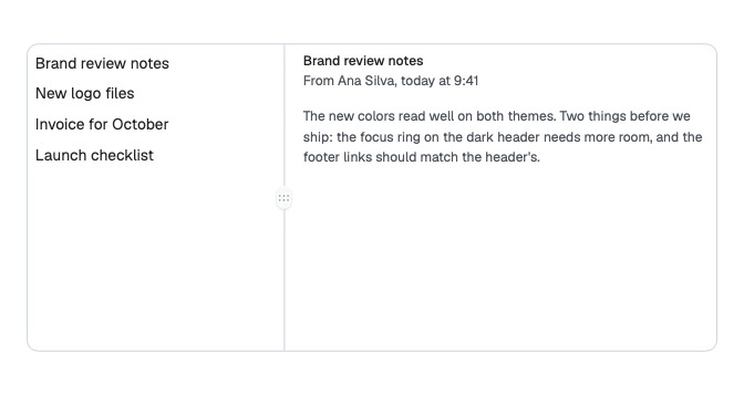
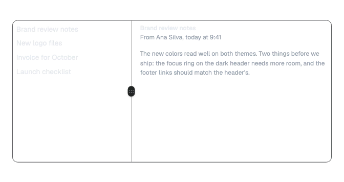 SplitterThe line between two panes that the reader drags, or moves with the arrow keys, to give one pane more room and the other less.
Color and design tools
12 components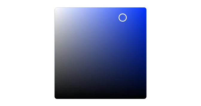
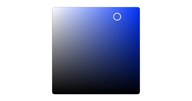 Color areaPicks two channels of a color at once, saturation across and brightness up, by dragging a thumb in a square of the colors of one hue.
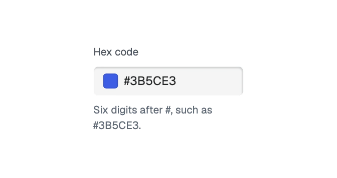
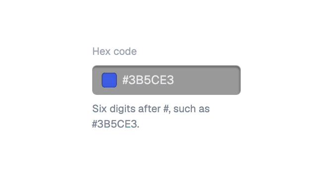 Color fieldA text field for a color code, such as #3E63DD, with the color shown at its start.
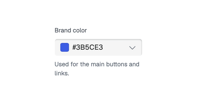
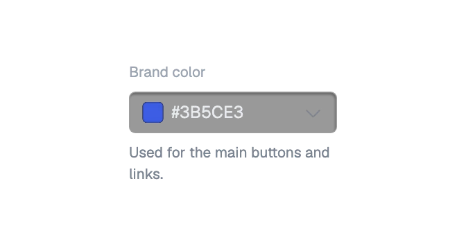 Color pickerA field or a swatch that opens a panel to choose a color: by dragging in a square and along strips, by typing its code, or by picking a saved swatch.
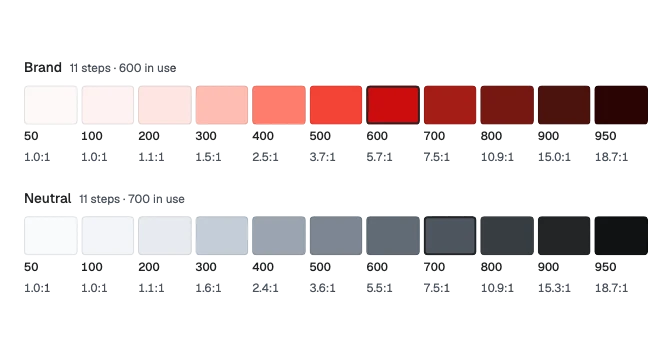
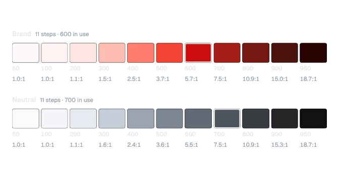 Color rangeThe steps of one color range in a strip, each with its swatch, its name and its contrast against white, with the step in use ringed.
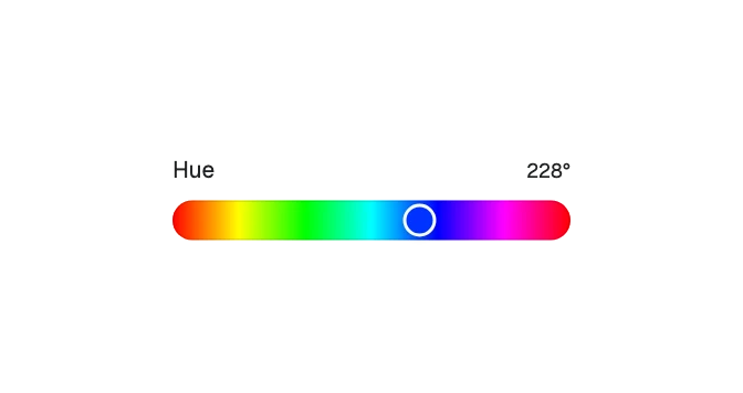
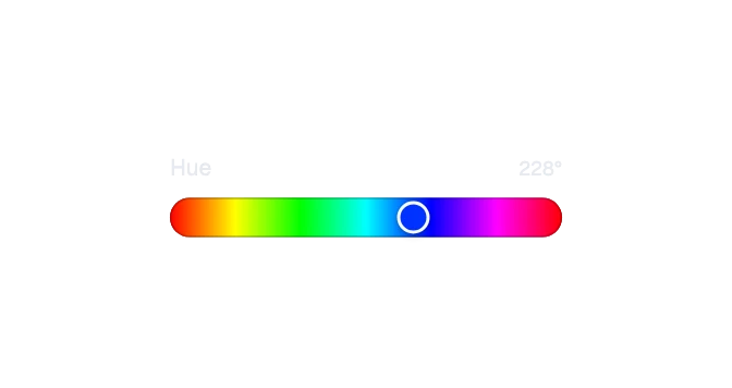 Color sliderPicks one channel of a color, its hue, opacity, saturation or lightness, by dragging along a strip that shows the colors it moves through.
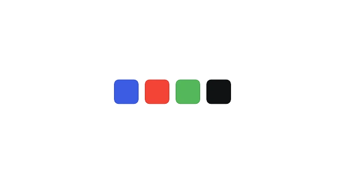
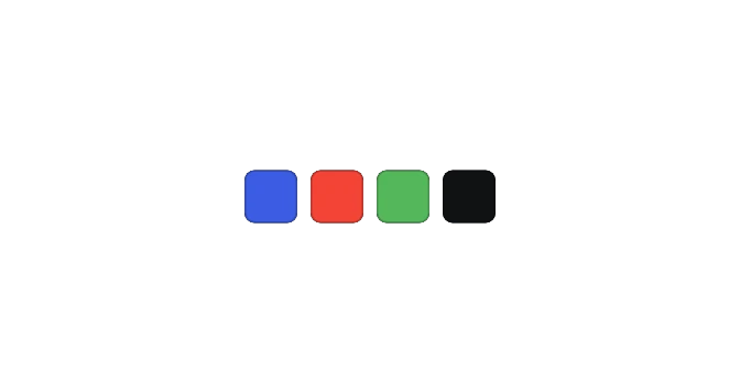 Color swatchOne color shown as a small square or dot, over a checkerboard so a see-through color shows, or crossed out when no color is set.
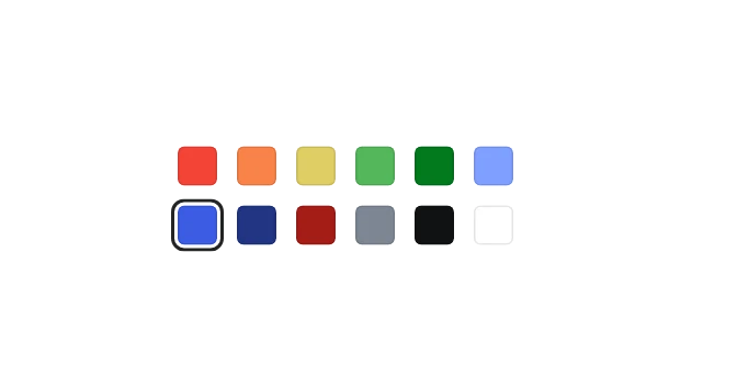
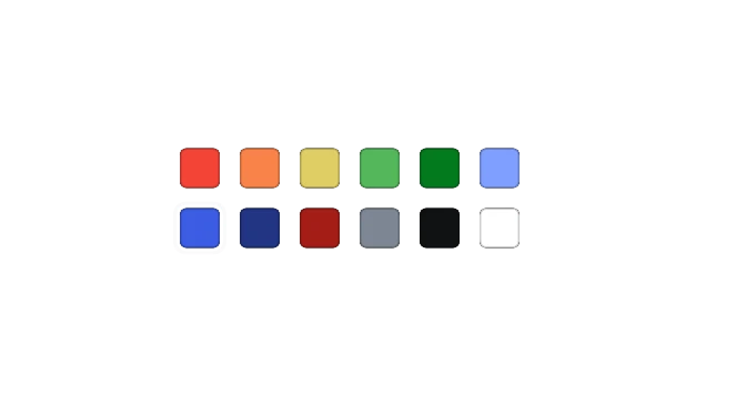 Color swatch pickerA set of colors to pick one from, such as saved colors or colors to try, in rows that wrap.
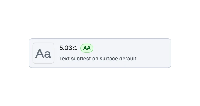
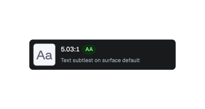 Contrast pairTwo colors drawn as text on its background, with their contrast ratio and the mark it earns: AAA, AA, AA large or fails.
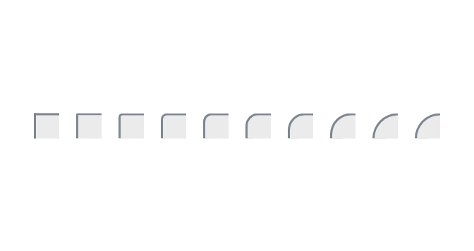
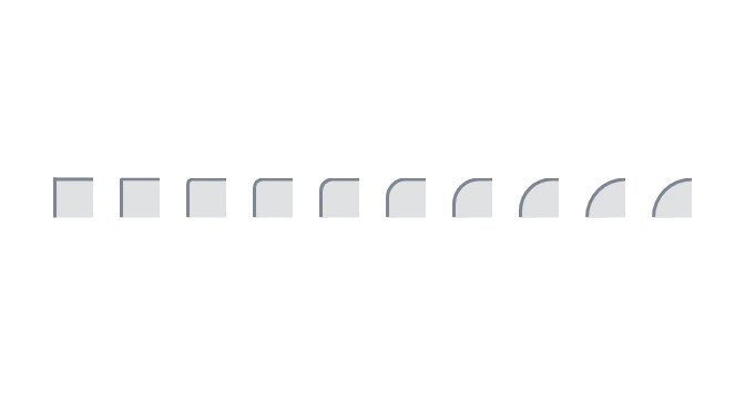 Corner sampleOne corner drawn at one radius, for a list of corner steps or roles beside their names and sizes.
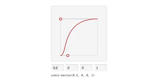
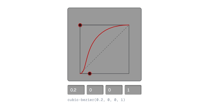 Curve editorA motion curve to shape by dragging its two handles, moving them with the arrow keys, or typing its four numbers.
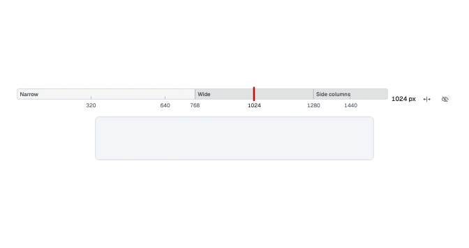
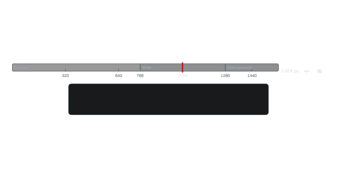 RulerA width ruler for a preview: the layout states and breakpoints along one band, the screen widths, and a handle for the width now.
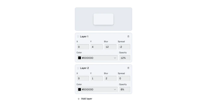
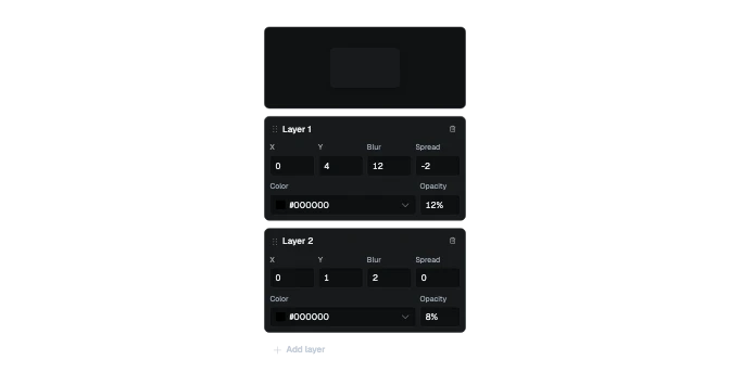 Shadow editorEdits one shadow: a preview card drawn with it, its layers with their offsets, blur, spread, color and opacity, and a button to add a layer.