Foundations
The token groups every component is built from. Each page explains the group and shows its tokens, rendered from the build.
Core
4 foundations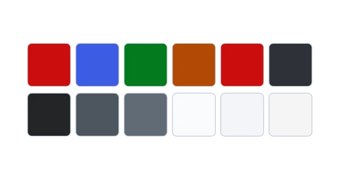
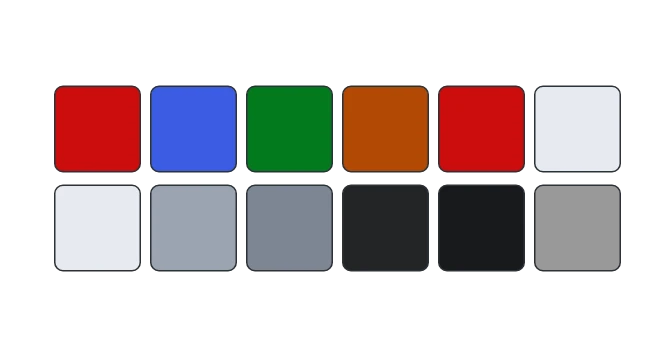 ColorColors named by the job they do, each with a light and a dark value, so one stylesheet serves both themes.
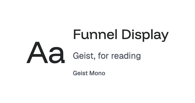
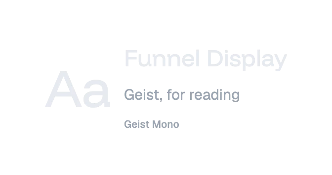 TypographyThe typefaces, text sizes and named text styles that every component sets its words in.
 SpacingThe distances inside and between things, from a control's padding to the rhythm between sections of a page.
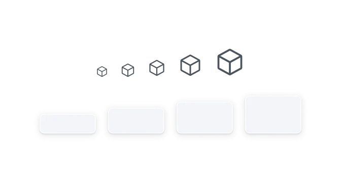
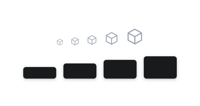 SizeHow big things are: control heights, icon boxes, touch targets and the widths content may grow to.
Shape and depth
5 foundations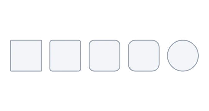
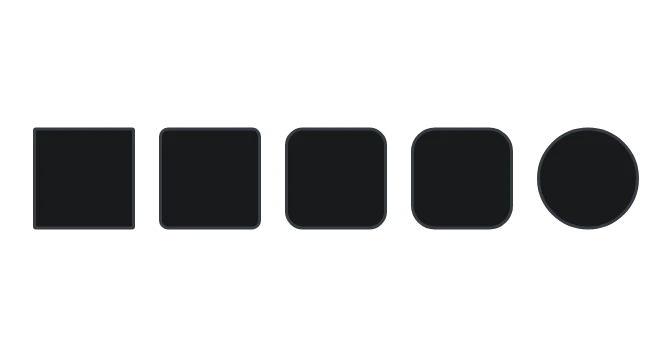 RadiusHow corners are rounded, so controls, containers and capsules each keep their own shape.
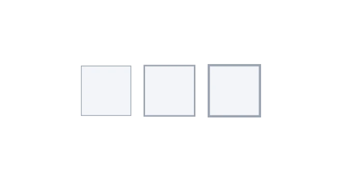
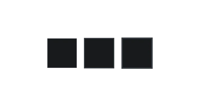 Border widthHow thick a line is: hairlines that separate and edge, two-pixel lines for emphasis, and thick rules for accents.
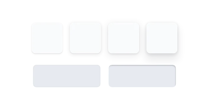
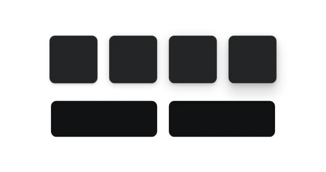 ElevationShadows that show how far a surface seems to sit above the page.
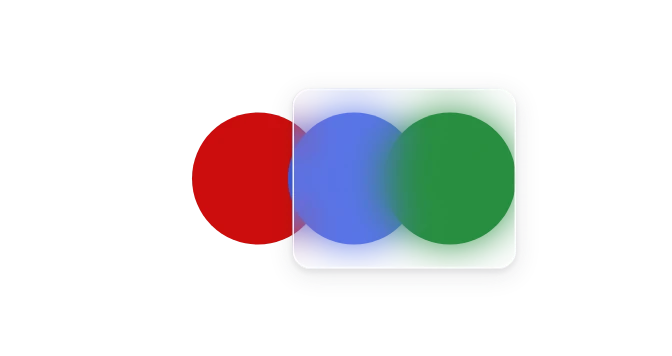
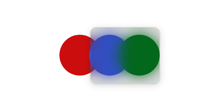 BlurThe frosted blur behind see-through surfaces, so a panel can show what lies behind it.
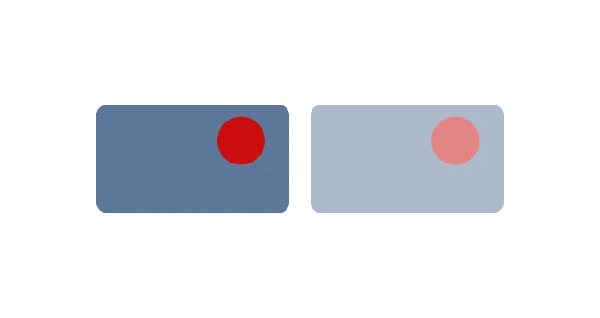 OpacityThe fade for a whole element that should read as unavailable, such as a disabled picture.
Behavior
4 foundations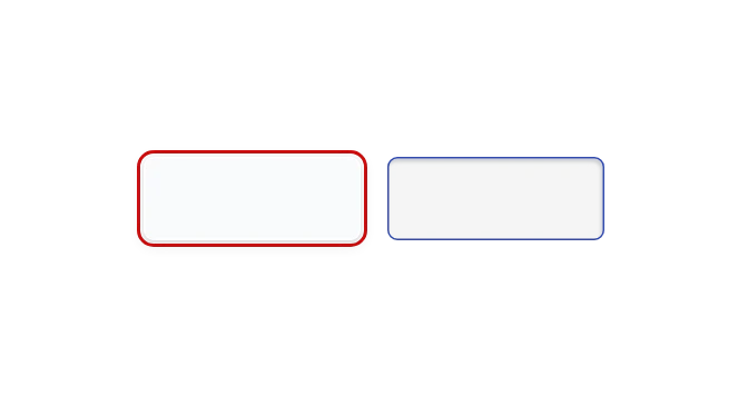
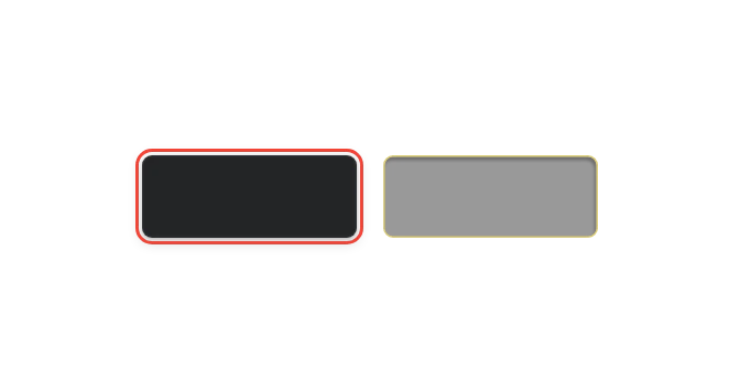 FocusHow thick the keyboard focus ring is and how far it sits from the control it marks.
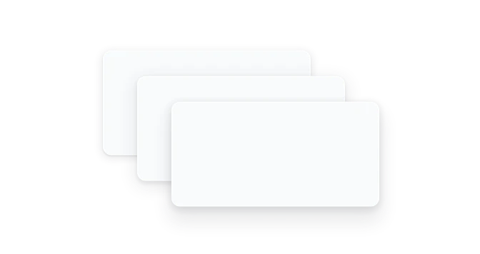
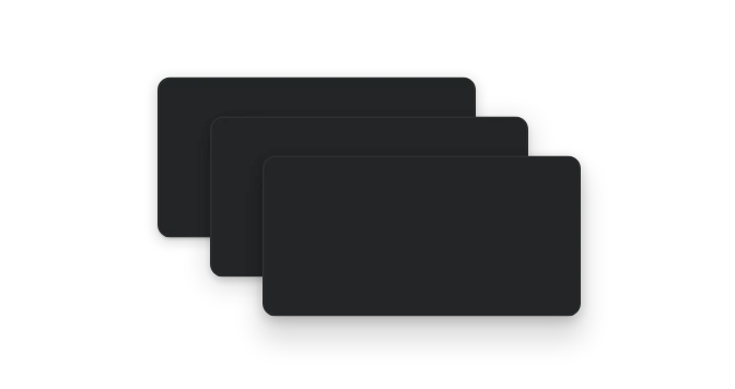 Stacking orderNamed layers that decide what sits on top when things overlap, such as a dialog above a menu.
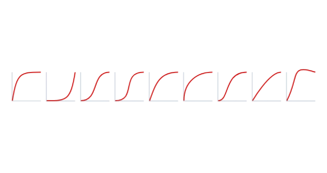
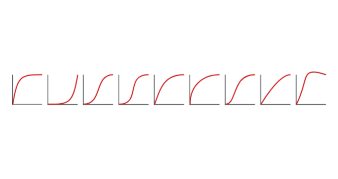 MotionHow long a change takes and how it speeds up and slows down, chosen by why something moves.
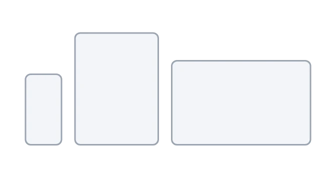
 BreakpointsThe screen widths at which text grows, components take their wide form and a page makes room for its side columns.